Jennifer & John’s Wedding
November 18, 2009
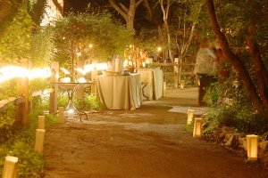
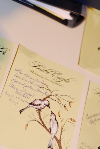
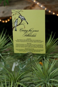
The wedding consultant came to me a week and a half before her client’s wedding, requesting a bird-themed design for the reception collateral. To make the fast approaching deadline, we used one of my past designs, changing the style and colors. I designed the Well Wishes sign and tags, Table Cards (named after birds), Favor Sign, Buffet Sign and Cocktail Sign. Rush jobs are not fun but they are possible!
Photography by Eric Hegwer
Wedding Consultant: The Simplifiers
Courtney & Jeff’s Wedding
November 13, 2009


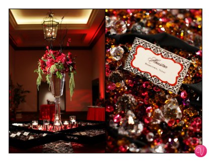
We had so much fun designing Courtney and Jeff’s wedding collateral. For the save the dates, we created oversize 6″ x 9″ cards in a die-cut frame shape. The front held the details of the wedding and the back illustrated a black and white damask pattern and the bride’s monogram. The invitation was off-white letterpress printed on extremely thick black linen cardstock (think cardboard). The response and reception cards were die-cut to match the shape of the save the dates. We also created itineraries for hotel guests, water bottle labels, koozie design, die-cut table cards and escort tent cards. This wedding was definitely what we call an “ooh la la” event!!
Design by The Inviting Pear (www.theinvitingpear.com)
Photography by Vanessa of Austin; Wedding Consultant: Ruby Rogers Studios
Retro Save the Date Postcards
November 12, 2009
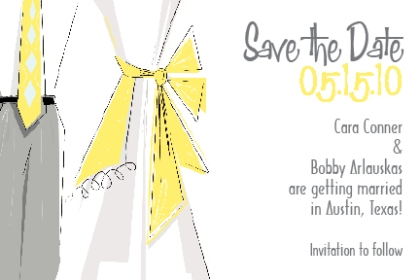
Save the Date postcard front

The back of the save the date postcard
Cara wanted her wedding save the dates to incorporate her colors of yellow and gray. Yellow is the new popular color to choose for weddings…and we love it! She also was very specific as to what she wanted for the design. She loves the style of the 1950s…everything from the graphics to the fonts.
By using retro elements in our design, we created that feel with her save the date postcards. Nothing is more fun that to create a design that the client was envisioning! Plus, to save Cara the back-wrenching task of hand addressing every postcard, the guests’ names were pre-printed on the address side of the postcard in a 1950s style font. Now, isn’t that groovy?!

